Wednesday, April 29, 2020

Game 181: E.T. the Extra-Terrestrial

Oh, E.T. If this isn't the worst game ever made for the VCS, it's certainly one of the most infamous. When I mentioned E.T. to my partner, who hasn't owned any video games since the Nintendo 64 came out, her eyes lit up and she exclaimed "I've heard of it! Didn't they find that one buried in the desert?"

E.T. was, in spite of its reputation, a success, selling over 1.5 million copies among a user base of between 10 and 20 million, making it one of the system's ten top selling games of all time. Nevertheless, it severely underperformed the lofty expectations of Atari and retailers, who are rumored to have thought it would expand the market. Today, E.T. is a often-cited example of the hubris responsible for the video game market crash of 1983.

Having played E.T., I feel that while this rushed game could have stood to benefit from a longer development cycle with playtesting and polish, its problems run deeper than that. Without a manual, E.T. is a deeply confusing game. Players, unaccustomed to reading instructions for these simple and self-explanatory games, would cluelessly guide that sickly green turtle goblin through a confounding maze of trees, pits, inscrutable icons, and more pits, fall into the pits, slowly float out, fall right back in, get dragged away by evil scientists, and have generally no idea what was going on or what their goal here was.

With a manual, the game makes sense. In fact, it's a very simple action/adventure - even simpler than Atari's Adventure, but that game was straightforward enough that you could figure out what was going on without a manual. E.T. is just obtuse about how everything works.

E.T.'s world consists of six screens, arranged in a pattern like the faces of a cube. On the top is the forest, where E.T. is marooned by his space ship. On the bottom is the town, consisting of an FBI building, the science institute, and Elliott's house. The four faces in the middle are a wasteland of E.T.'s infamous pits, in which three pieces of E.T.'s interstellar telephone are buried. Within any of these screens, walking north will take you to the forest, walking south will take you to the town, and walking left or right will take you on an endless loop of these four screens.

Your goal is simply to find all of the telephone parts, and then go to the forest and phone home, wait for the space ship to arrive, and take off. You can beat the game on the hardest combination of settings in only a few minutes once you know what you're doing.

Jump to the 2:21 mark if you just want to see the part where I know what I'm doing. Everything up to that is just searching for the one pixel in the game that lets you summon the space ship home.


You might wonder, how on earth are you supposed to have the patience to search every single hole for your telephone parts? Thankfully, you don't have to. As you walk around, these various icons appear on the screen. These icons represent context-sensitive actions which you can perform by pressing the joystick button. Each screen has sixteen invisible zones, which are randomly associated with a context action.

One possible screen layout


The question mark is key. Using it causes a pit on screen to blink if it has a telephone piece inside. Alternately, if you collect nine Reese's Pieces which you'll find scattered around the world, you can trade them to Elliott for a phone piece, but you've got to find the action zone for that too.

To hinder you are the earthlings. Elliott doesn't do a whole lot except take Reese's Pieces bribes, but the FBI will steal your phone pieces and rebury them, and the scientist will drag you to the science institute if he catches you, though you're free to leave as soon as he lets go. Any earthling - Elliott included - will prevent E.T.'s space ship from landing if they're in the forest area when you summon it. Using the jail-like action icon will make the scientist and FBI agent flee if they're on-screen.

Other actions include:
  • Teleportation - instantly move one screen in the direction of the arrow. You can still land in pits this way.
  • Reese's Pieces - eat one of your candies for some extra energy.
  • Space Invader - call E.T.'s space ship, but only if you've got all of the phone parts. There's only one in the whole world.
  • Landing zone - only found in the forest screen. Wait here after calling the space ship, and eventually it will land and then you win the game.

To beat E.T., the first thing you'll want to do is locate the Space Invader action. Even though it's one of the last things you need, you really don't want to be searching for this while your inventory is full of phone parts and candy that the FBI agent can steal from you.

The worst screen in the game. God help you if the Space Invader is in the top or bottom row here.


While searching, you'll also want to take note of important actions zones, especially question marks and jail cells. It wouldn't hurt to also use the question marks whenever possible to find out where the phone parts are. Then once you know where the Space Invader action is located, get the phone pieces while avoiding the humans by using the question marks in each of the pit screens, multiple times if necessary, and use the teleporters and jail zones to get away from the nasty humans / force them to get away from you. In the event that you can't find the third phone piece, bribe Elliott for it. Then summon the space ship, retreat to the forest, wait for its arrival, and you win!

There are three game modes, but the only difference is that modes 2 & 3 make the game easier by disabling the detrimental humans. Mode 2 gets rid of just the scientist, and mode 3 gets rid of both him and the FBI agent. While a lot of that sounds like it would make the game more tolerable, turning off gameplay elements just doesn't seem true to the E.T. experience. Difficulty switches control enemy speed, and also determine whether or not the space ship can land when Elliott is around.

GAB rating: Bad. There's just no reason for a game this simple - there's barely a few minutes worth of gameplay here - to be so baffling.

Even when you know how to play, everything about the experience is just plain annoying. Getting stuck not being able to find the Space Invader zone, absolutely crucial to winning the game, is the most annoying thing of all. Searching the stupid Screen of Many Pits for the one pixel that activates the question mark zone is annoying. Getting constantly interrupted by the humans is annoying. Having an FBI agent suddenly appear on screen and steal your phone parts before you can react is annoying. Walking onto a new screen and immediately falling into an unseen pit is annoying. Floating out of a pit only to fall right back in is annoying. Your slow, slow walking speed is annoying. The screeching sound you make when sprinting is annoying. Having the space ship abort its landing sequence and force you to summon it all over again because a stupid human was on screen is annoying.

On top of that, during the play session that I wound up using for the video, I was pretty sure that the jail action zone in the forest moved between the beginning and the end of the game, and reviewing the recording confirmed this. Dick move, Kleeborp.


There's a fanmade patch that fixes several of E.T's perceived issues, but I haven't tried it. From the looks of it, the single biggest difference is that it re-works the pit collision detection, making that aspect of the game far less annoying (but also makes collecting Reese's Pieces harder), and I definitely approve of the extra game mode that removes the FBI agent but keeps the scientist, for a mode more challenging than the original's Elliott-only mode, but without undoing your progress. It also fixes E.T.'s color, which is an issue I might have cared about if the gameplay was good. But even if it eliminates all annoyances with regards to accidental pitfalls, it still doesn't solve most of the problems, the biggest one being the need to lawnmower-search the whole game world for the Space Invader zone.

Monday, April 27, 2020

Games 179-180: Video Pinball (VCS) & Dragonfire

Imagic's debut year of 1982 was a productive one. In March, they released Demon Attack for the Atari VCS, followed quickly by Star Voyager and Trick Shot. In July, they released Atlantis and Cosmic Ark, a diptych that I reviewed earlier this year. In September, they released another pair of VCS games, Riddle of the Sphinx and Fire Fighter. In October, they released four Intellivision games; Microsurgeon, Beauty and the Beast, and greatly expanded ports of Demon Attack and Atlantis. Finally in December, they released their final game of the year, Dragonfire for the VCS.

The manual credits development to Bob Smith, whose prior credits include Video Pinball at Atari, porting Tanktics to the TRS-80, and the aforementioned Star Voyager and Riddle of the Sphinx at Imagic. Bob Smith's Video Pinball, running on the VCS, is separate from Atari's arcade game with the same title, and as Smith's first original title, I felt I had to play it.

Game 179: Video Pinball (VCS)

I thought I was done with pinball video games for awhile! The best, it turns out, was not saved for last.


It's... not as bad as it looks, provided you aren't expecting this to play much like a pinball game.

Actually, there's one thing here that Smith did very right. All of the Apple II pinball games that I played used dual paddle controllers, which helped with immersion but made it a horrible inconvenience to nudge the table in the games that even allowed it. Here, everything is done with the joystick. You tap left for the left flipper, right for the right flipper, up for both, down to pull the launch plunger, and press the button to release it. To nudge, you hold the button and tap the stick in a direction. This is key to controlling the ball, and there isn't very much flipper action thanks to the huge, very bouncy targets and the fact that the floor is flat instead of inclined. Nudge the ball in one direction for too long and you'll tilt, but there's no risk of this with rapid fire light taps, and the amount of time you can sustain a single nudge without tilting isn't random or hard to figure out. Trying to fight the ball's lateral inertia is mostly futile unless you're chasing a roller, and nudging up and down doesn't seem to do anything, but nudging into the ball's trajectory can help.

There are two meaningful gameplay options. Difficulty B plugs up the two side-drains, which makes it nearly impossible to lose the ball, so I stuck with difficulty A. Then there are four game modes; mode 3 only differs from 1 by resetting the bumper value whenever you lose a ball, and modes 2 and 4 are pointless two-player variations of 1 and 3. I stuck with mode 1, because who wants a lower scoring game?

The targets have these scoring behaviors:
  • Bumpers are initially worth 100 points per hit.
  • Hitting all three diamonds raises the bumper multiplier by 1 each time. In game mode 1, this lasts the whole game, but in game mode 3 this resets when the ball drains.
  • Hitting the right rollover with the Atari logo four times gives a free ball. You can only do this once per ball.
  • Hitting the left rollover increases the number on it by one. When the ball drains and you didn't tilt, you get between 1,000 and 4,000 points for each accumulated hit. I don't really understand the logic that determines the value per-hit. One time I got it to 4 and earned 12,000 points, another time I got it to 6 and only earned 5,000. The manual claims you get 1,000 points for each rollover up to a maximum of 4,000, but this is clearly wrong.
  • A special target near the middle of the screen randomly lights up for four seconds at a time and is worth 1,000 points per hit.

Of my 48,726 points, 17,000 came from the left rollover bonus, and I conservatively estimate that 28,000 came from hitting the bumpers. That was with a maximum bumper value of 300 points, which can go way higher than that, so I think it's clear that diamonds are the most valuable target, points-wise, and obviously the earlier, the better.

Anyway,

GAB rating: Below Average. I said it's not as bad as it looks, but it's a long way from good, even with tempered expectations. My interest in a pinball game, real or simulated, is proportional to how much stuff is on the table, and being a VCS game, there's not much here. Most of the good stuff is at the top half of the table, and there aren't many ways of deliberately getting the ball up there from the bottom, given the flat ramps and weak flippers. The emphasis on nudging over flipper action does make for a very different experience, but doesn't make it fun, just different. I didn't hate my existence for the time I spent on this game, but I have no desire whatsoever to try to improve on my score, even though I'm certain I could if I so desired.

Of all the pinball games I've played for Data Driven Gamer, this one ranks almost last, being worse than the arcade game, but better than Bill Budge's Trilogy of Games Pinball, which I did not rate. I'm pretty sure that I'm done with video pinball games for awhile, until we get to Pinball on the NES, and after that there isn't any pinball on the agenda for a very long time, until the 1992 phase.

Moving onto 1982 at Imagic,

Game 180: Dragonfire

The manual is adorned with a seriously ugly dragon image, looking something like a a snake who is leatherfacing an iguana's poorly-fitting epidermis, and a bunch of tendrils and teeth glued on like something out of a Flash Gordon serial. Dragons have occupied the castle, and you, a spry young prince, have volunteered to sneak in and retrieve its treasures. Supposedly the king needs these treasures to raise an army to fight the dragons, but alas, when you escape the castle alive with all of the treasures, all you get a new castle, occupied with a more difficult dragon to run away from.


Gameplay alternates between two phases, like Cosmic Ark, but they're more interesting. First, you have to approach the castle and avoid fireballs, which are spat at you high and low. This phase has an unchanging difficulty factor, and I found I could pass it fairly consistently with a basic strategy; run for the middle of the screen and wait for the fireballs to come. Most of the time a high ball comes first and is followed by a low ball, so duck under the high ball, and then when it passes, run to the left and jump over the low fireball when it comes, and pray you don't get torched inches away from the castle entrance, which usually doesn't happen with this strategy. Your running momentum carries with your jump, so it's easier to jump over the low ball if you're also running toward it. Sometimes the fireballs come out so closely together that you can't dodge both from this position, and when this happens, retreat to the safety of the right side of the screen and try again once they pass.

The second phase involves scooping up the treasures in the castle hold while the dragon crawls around on the bottom of the screen and shoots more fireballs at you. The dragons have simple movement tracking behavior, but avoiding their fire on the harder castles is no picnic as both the dragons and their fireballs move faster than you do. This phase gets really annoying, because the prince skids around the floor like he's wearing socks at a skating rink. It's infuriating to keep sliding right past a treasure because the controls didn't handle quite the way you expected them to. And if a treasure appears right at the bottom of the screen in the middle longitudinal section, good luck recovering it without getting torched by a dragon that can instantly zip right into burninating range from either edge of the screen. You can also take refuge by retreating to the hold door, and this can be strategically useful as it allows you to wait a bit in safety until the dragon moves to a position where you can more safely emerge and snag a treasure, but also risky thanks to the slippery controls which can cause you to miss the egress entirely and get trapped on the edge of the screen instead as the dragon pins you down against it with a barrage of fireballs.

Difficulty switches don't seem to do anything, and game modes determine the starting level along with the usual pointless two alternating players option. You can start on castle 1, 3, 5, or 7, and the difficulty peaks at castle 9, which is guarded by a white dragon, and all subsequent castles also have a white dragon with the same movement speed and behavior. Reaching castle 9 doesn't even take two minutes, so this option seems a bit superfluous, except for the fact that I don't even last two minutes on my best playthrough, in which I lose my last life on castle 10.

Unusually, Dragonfire gives you seven lives, far more than the traditional three. But you lose them fast, and there's no way of earning more.

GAB rating: Average.

I've now played Imagic's Demon Attack, Atlantis, Cosmic Ark, and Dragonfire. Apart from their debut title Demon Attack, none of these rated better than Average. Imagic's gameplay concepts are novel, and they all look really nice with due consideration to the system's limitations, but they're just not that much fun to play for more than a few minutes. I can almost imagine Imagic picking up gameplay concepts that Atari rejected on the grounds that they weren't fun, and then building the most polished and technically impressive games that were feasibly possible around these rejected concepts, enhanced with colorful visuals far beyond anything Atari themselves ever attempted on their own system. It's almost ironic that Demon Attack, being so obviously derivative of Space Invaders, is also the most fun I had with any of their games. Maybe it's not fair to judge their library based on only four games when they were so prolific, but if Mobygames votes are anything to go by, these are their four most widely played games by a big margin.

Imagic's output of 1983 was even greater than of 1982. In January through May, they produced nine games, seven of them targeting the Intellivision as the lead platform rather than Atari VCS. In June through December they released another seven games, all of them VCS-focused. None of these games were hugely successful by any metric from what I can gather, and none qualify as whales. In 1984, with the video game market not yet recovered from its 1983 decline, they focused on Atari, Commodore, and IBM personal computers, with their sole console output consisting of two ColecoVision ports of non-Imagic games. Finally in 1985, they released two interactive fiction games on personal computers, before being absorbed by Activision in early 1986.

Friday, April 24, 2020

Game 178: Buck Rogers: Planet of Zoom

Sega is well known for their trailblazing and often ahead-of-their-time work in 3D video game graphics. Even Zaxxon, their breakout video game and earliest whale on this blog, explored the use of pseudo-3D axonometric perspective long before it was commonplace. Before the age of emulation, this was lost on me; my first exposure to the company name was through the Sega Genesis, which to me was basically an upgraded NES, with similar sidescrolling action games but with much improved visuals, audio, and slicker, zippier gameplay. Their achievements in 3D graphics continued in the arcades, and spilled over a bit into the Genesis' library, but this did not characterize my view of the platform the way that 2D sidescrollers did.

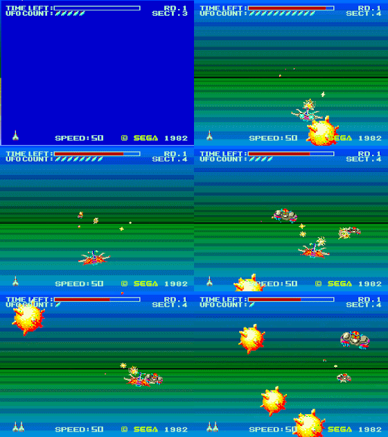
Zoom 909, released internationally as Buck Rogers: Planet of Zoom (with zero connections to the long running multimedia franchise except the cabinet artwork), is the second Sega whale, and takes 3D perspective to the next level, offering a speedy third person perspective with parallax scrolling starfields in the space stages, convincing 3D terrain and obstacles in planet surface and trench stages, and some not so convincing sprite scaling effects everywhere. This isn't the first game to offer this kind of perspective, but no such game before it has been so steadily fast, or had so much stuff going on at once. This is very much an ahead of its time game, which isn't really a good thing.


Planet of Zoom plays like a rail shooter, though your relative freedom of movement depends on the stage type. Space zones control like Star Fox, with free up-down-left-right movement, but your general direction is ever forwards-moving. Trench stages are largely about lateral manuevers to avoid obstacles, with very limited up and down movement. Planet surface stages allow turning in any direction, though there's nothing on these planets to make them worth exploring. All stages allow you to adjust your engine speeds in a range from 1 to 99, but this ability is easily forgotten.

The pseudo-3D graphics are powered by an upgraded version of the PCB that powered Sega's Turbo in 1981, now running at 60fps instead of 30, with 1024 onscreen colors, and a 512 pixel wide resolution. The sprite scaling, unfortunately, is this game's Achilles heel. Unlike Turbo, where objects were always on the road, Zoom's got free-flying objects of every altitude zipping about all over the place, and consequently the game's representation of 3D space makes no sense at all.


Sprites routinely overlap your spaceship when they should be in the distance. Even shadows of the enemy ships, seen during trench and planet surface stages, will overlap your ship. The schizophrenic 3D collision detection allows you to pass right through some obstacles, while others will kill you for being in the same time zone, and judging objects' depths is impossible even in the stages where they cast shadows on the ground. In the above shot, just how big are those space mines anyway? Are they just utterly ginormous, or did I get hit by one in the foreground? In most of the stages you can also forget about shooting enemies accurately; just keep firing and you'll hit what you hit.

Make it to the eighth sector, and you fight a very large but pathetically easy boss, if your brain can handle the nonsensical perspective where your ship and your missiles are drawn behind it despite also being in front of it.


Sega's "VCO Object" hardware, used for the last time in this game, supposedly involves analog sprite scaling circuitry, but that could have fooled me. Sprites do not scale smoothly, but "step" through a small number of discrete sizes. This is extremely obvious in the boss stage, but evident with all sprites except for explosions, which do scale smoothly. I thought at first this might be an emulation issue, but video footage of real hardware shows this is accurate.

Zoom is one of few arcade games of its time that allow continuing from your current location on a game over. Unusually, continuing does not reset your score, making a high score achievement completely pointless. Anyone, with enough quarters, can get a high score no matter how badly they play. It doesn't take very long to flip the score counter either; I managed on round three.

GAB rating: Below Average. Planet of Zoom might be historically important, and its presentation may be unprecedented, but like its hardware predecessor Turbo, it does not play well at all. I'd go as far as to call it mechanically broken, and perhaps saved from a Bad rating only by merit of being a rather easy game, which isn't good, but I'd rather a game be too easy than be hard for the wrong reasons.

Wednesday, April 22, 2020

Games 176-177: Bosconian & Time Pilot

There's something very appealing to me about progression through multiple periods of history. Not a lot of games follow this trope - it's not merely time travel, but to begin at the dawn of history, or whenever the developers deemed an appropriate starting point, and to work your way forward in time, gradually seeing things become more advanced, and concluding in present day or perhaps the future. Some examples that come to mind include Time Commando, Sega GT 2002's "Chronicle" mode, E.V.O.: The Search for Eden, Eternal Darkness, and Time Gal. As I wrote this paragraph, I thought about what I'm doing here right now, and said to myself "duh, of course there is."

Konami's Time Pilot, then, is one of these games, a five-stage multidirectional arcade shooter about blasting your way through aviation history, for no apparent reason.

The historical record states that its fledgling designer Yoshi Okamato was tasked with creating a driving simulator, but enjoyed Namco's Bosconian so much that he surreptitiously developed a 2D scrolling shooter instead. Time Pilot tested well, and proved the old adage that it is better to beg forgiveness than to ask permission, provided you also make your supervisor money.

Though Bosconian didn't meet my requirements to play during the 1981 phase of Data Driven Gamer, its connection to Time Pilot makes it relevant here.

Game 176: Bosconian


Bosconian - a title I assume to be a reference to the Boskone of Lensman - looks like a logical evolution from Galaga, moving the playing field from a single vertical screen to a wide open asteroid field, with radar showing you the approximate locations of the enemy bases which you must destroy.

There are at least two distinct versions of the game, and I opted to play the "old version" which features different map layout orders from the "new version."

Gameplay centers around finding and destroying these bases, while dealing with swarms of enemies that initially pose more of a distraction than a threat, but tarry too long and they'll spawn and attack with increasing aggression, launch in formations (which can be broken up by shooting the color coded leader), and eventually will go into "RED ALERT" mode, where their speed doubles and they will make every effort to ram you.

The bases themselves are most easily destroyed by firing a single shot into their missile bay when it opens. You could also take out the six individual orbital cannons, but this seems needlessly slow in comparison, even on later rounds when they'll fire E-type missiles at you from said bays.

Bosconian's most famous precedent might be having a continue screen, making it one of the first, but I didn't see much point. It's an endless game, and even though the stages have different layouts, they all kind of feel the same.

GAB rating: Below Average. I just found this game tediously dull. The arrangements and orientations of the enemy bases do provide some strategic depth, and you can use the asteroids and mines as cover for yourself by luring enemies into them instead of going out of your way to shoot them, but this wasn't enough to make the game interesting. I didn't feel challenged at all while playing Bosconian, and if it gets challenging later, I wouldn't know, as I lost interest well before reaching that point if it even has one.

Game 177: Time Pilot


Time Pilot spans five time periods with increasingly challenging opponents and their deadly weaponry:
  • 1910 - Biplanes drop bombs in parabolic arcs
  • 1940 - WWII fighters accompanied by armored bombers
  • 1970 - Helicopters armed with homing missiles
  • 1982 - Jet fighters slightly outpace your own vehicle
  • 2001 - UFOs have two types of energy weapons, and their radial design makes it difficult to read their heading

In all stages, your goal is the same. Blast 56 of the fighters while avoiding their fire, and at some point after that, a boss vehicle shows up. Destroy it, which is frankly much easier than killing the basic fighters thanks to their slow speed and inability to change directions, and you time warp to the next era.

Unlike a lot of multidirectional shooters, your plane has a fairly wide turning radius. It's risky to try to turn around 180 degrees and gun down a pursuing squadron; it will take time, they'll close some of the distance as you're turning, and trying to dodge fire during a wide turn is tricky. The Copernican perspective can also throw you for a loop, as you may not be used to judging your own turns relative to enemy fire from this uncommon point of view. Thankfully, the enemies (and later on, their missiles) have even wider turning radii, which is crucial in the later stages, as homing missiles and jets will fly faster than you do and will beat you in a straight chase.

Sometimes you'll see parachutists - between these and the WWI bombs, the game seems to have a hard time deciding whether the perspective is top down or side view - and collecting them is the best way to score points. They're also a game breaker if you're more interested in scoring points than clearing rounds. The fifth parachutist and beyond are worth 5,000 points each, regardless of stage, and the optimal high score strategy becomes deliberately not advancing past second stage, where parachutists spawn forever and you don't have to deal with homing missiles. Every 10-12 parachutists are worth an extra life, and consequently you could play forever.

Even with an orthodox playstyle, Time Pilot's surprisingly lenient for an arcade game. It's a bit slow paced, things aren't too difficult to dodge, and the action never feels overwhelming. I had no trouble at all reaching 2001 on my first try, and I beat it on my second. The above video depicts my third attempt, and although I lost on stage 6 where it loops back to 1910, I feel this had more to do with my attention span waning than with the increased difficulty.

GAB rating: Average. Time Pilot's mechanically sound and looks really nice with its spritework and parallax-scrolling clouds, but personal thematic appeal aside, it's not very exciting or deep, and by 1982 we've had multiple arcade shooters that manage to be both. The game's fine, and it's more interesting than Bosconian, but I'm more than ready to move on.

Monday, April 20, 2020

Game 175: Night Mission Pinball

When I planned out the 1982 phase of Data Driven Gamer, I didn't realize there would be so much Apple II pinball involved. Pinball Construction Set and Night Mission Pinball are the only whales in that category, but to the former, Bill Budge's Raster Blaster and Pinball turned out to be important predecessors, and David's Midnight Magic was arguably the most prominent of Broderbund's early in-house titles.

The best, it turns out, was saved for last, as Night Mission Pinball frankly blows the rest of them away both in terms of physics and table design. I can't tell if having sifted through so much comparative mediocrity helps me to better appreciate this game's improvements, or if I appreciate it less it because I'm completely sick of pinball video games by now.

I did laugh a bit when I saw the table design.


Where have I seen this before?

Oh, right.


Although I don't know Pinball Construction Set's precise release date, I think it's safe to assume Budge lifted the design from Night Mission and not the other way around. TVTropes claims that Night Mission is based on Stern's Flight 2000, and although I can see some similarities (the lighted ramp on the left is a dead ringer), it's clearly not a copy+paste job to the same extent that Raster Blaster and Midnight Magic were of Firepower and Black Knight.

Night Mission uses the familiar dual-paddle control scheme, with the left dial controlling plunger reach, and keyboard keys can bump the table left or right.


The pinball action finally feels right. Again, I'm not the best judge of what passes for realistic pinball physics, but to me this feels about as good as Windows 3D Pinball. Previous games fell short of that standard, but until now I had no idea it was possible to do that on a 1 MHz, 48KB machine.

Bumping the table also feels pretty good physics-wise, but as with other games, it's not easy at all to reach for the keyboard while gripping a paddle in each hand. The only times I ever felt comfortable doing this was when the ball was above the N-I-G-H-T lanes and I might nudge the ball into one of them, and even then this felt risky. Each nudge also has a random chance of tripping the tilt sensor, and your first nudge is just as likely as your tenth. You can play entirely with the keyboard instead of the paddles so that you can reach the bump keys more easily, but I wouldn't recommend this. Keyboard-only play loses the ability to sustain a flipper hold - it seems the Apple II's keyboard can only tell when a key is initially pressed, and not when it's being held down or released.

And the table itself? It's pretty sweet. Unlike all of the other pinball games I've seen on the platform, this has a recognizable and well-realized theme - of a WWII RAF strategic air raid - and has reasonably decent sound effects of droning engines, falling bombs, crashes and explosions throughout gameplay. The video table doesn't do anything that isn't possible on a real one, but with about 20 interactive gadgets, targets, lanes, and a dozen table lights and indicators, this is the most complex one I've seen yet. The high gadget density does mean less flipper action than, say Raster Blaster, but I'm okay with that.

If you can complete the N-I-G-H-T lanes, you'll activate wizard mode, where the ramp lights up and you can shoot balls into the dive bomb chute in an attempt to drop your bombs for big points. Afterward, completing the F-L-Y target sequence will turn the bomb chute into a ball holder, which can hold up to four of them for multiball mode. There are also a number of ways of winning free games - activating the D-R-O-P lanes, getting a high score, getting the match score (which is rigged, just like in a real pinball machine). All pointless, considering games are free anyway.


Night Mission also features a "fix mode" for adjusting ingame parameters. Make no mistake, this is not a user-friendly WYSIWYG table designer like Pinball Construction Set, but a developer's tool that subLOGIC simply decided to leave in the game. The 11-page "adjustment manual," included in the box alongside the much shorter standard one, notes as much, pointing out that some of the settings were meant to help the developers gather data for debugging their code, and that some settings can crash the program at extreme values or combinations. You can't design or adjust the table, but while Pinball Construction Set had only four world physics parameters adjusted by simple slider controls, Night Mission's got 40, most of them adjustable in integer ranges from 0-127 or beyond.

All of this is pretty overwhelming, and the standard game manual makes no mention that this mode even exists. There are ten preset game modes on the disk which simply represent different combinations of fix mode settings, but I found the one called "Competition mode" to be the most playable and the most fun. I didn't spent a lot of time messing around here, but found it pretty neat to see an early example of developer's toolkits being bundled with the game, and it stands as a very interesting contrast to Pinball Construction Set's player-oriented approach, being simultaneously more powerful and less powerful.

GAB rating: Good. I'm still not a pinball fan, but I had fun with this one, and that's more than I can say for any of the other such titles I've delved into this past few weeks. Who would have known that this fast-paced and polished arcade game would come from a company mainly known for an austere flight simulator? In the manual, SubLOGIC claims that they spent countless hours playing, observing, and measuring the physical aspects of pinball and did intense number crunching to ensure their physics model produced accurate results, and I believe it. The table design is original, fast, and fun to play, and I happily promote Night Mission Pinball to the ivory deck.

Friday, April 17, 2020

Game 174: Flight Simulator

Boy, am I the wrong one to review this game, if you can even call it one.

The only “serious” flight simulator I’ve ever played before in my life was on some demo diskette for the black & white Macintosh, and I couldn’t even figure out how to take off from the runway. I don’t know my rudders from my ailerons, I have no idea what a tachometer is, and I’m not even completely sure what I’m supposed to do with my own car’s RPM indicator. And the manual seems to suggest that this game was designed by pilots, for pilots, and recommends reading a real-life flight manual before playing.

So, yeah, completely out of my comfort zone here.

Read a more in-depth history of Flight Simulator here:
http://josef.havlik.sweb.cz/historyenglish1.htm


The full title is “A2-FS1 Flight Simulator with British Ace 3D – Aerial Battle,” and was released by subLOGIC in January 1980. Like most Apple II games of the time, it was distributed on cassette tape and only used 16KB of RAM. Unlike most Apple II games of the time, it used assembly language, rather than the more commonly used BASIC. A later, 32KB revision on floppy disk implemented additional features, and was simply called “Flight Simulator.”

This game is not directly related to the Microsoft Flight Simulator series. The first game in that long running series is based on subLOGIC's later Flight Simulator II, rather than either version of this first title.

For this entry, I am playing the original cassette game. For those of you who want to do the same, and are using the tape image from BrutalDeluxe in MAME, I’d tell you to read the manual for tape loading instructions, but anyone trying to play this without the manual is going to be hopelessly lost anyway. But there is one critical thing not mentioned in the manual – make sure you allow the tape to play for at least 15 seconds before entering the load command. Type it out, start playing the cassette, wait 15 seconds (but no more than 23), and then press enter.

This kept happening until I figured the timing out


This is normal


Simception! A flight simulator within an Apple II simulator.


The 37-page manual begins with an introduction to the concept of a flight simulator. The term and concept were nothing new even in 1980, but those available to civilians lacked graphics and weren’t terribly exciting or useful for training pilots. Military grade flight simulators were the best and most complete, but ran on custom-built computers and cost millions of dollars.

SubLOGIC’s Flight Simulator may be the first of its kind; a fully graphical flight sim that ran on a mainstream consumer-grade microcomputer. Mobygames has no earlier examples that are quite comparable. Among its features, most of them standard in the genre, include:
  • Realtime 3D graphics (at a 3.5fps average, which even the manual admits is inadequate for convincing flight simulation)
  • A complex physics model, which simulates 23 different aircraft characteristics
  • Extensive flight controls
  • 18 VFR instruments
  • Radar
  • A combat simulator mode

The introduction also notes that even though FS1 is best-in-class, microcomputer flight simulators have a long ways to go, and (correctly) predicts “astounding” improvements over the next few years. FS1 simulates only one aircraft; the Sopwith Camel, famously used in WWI, for the relative ease in modelling an early and somewhat primitive mass-produced vehicle, and for its physical similarity to then-modern civilian light aircraft.

The 37-page manual summarized the controls, and interestingly, recommended keyboard controls despite offering joystick and paddle support (and noted that the superiority of keyboard controls ran contrary to their own expectations that joysticks and paddles would be an improvement). The most crucial keys are TFGHVB. FGH are used to control plane roll with a linked rudder and ailerons, and TVB are used to control pitch by activating elevators. Arrow keys – which on the Apple II keyboard only come in left and right – are used to adjust throttle.

There were a lot of notes aimed at non-pilots, such as pointing out that banked airplanes do not stop turning when the controls are centered as with automobiles, and must roll in the opposite direction to negate a turn. Or that down on the keyboard means up and up on the keyboard means down. But it still seemed to leave out a lot of basic flight instruction. For instance, it showed me how to read the oil pressure and temperature – it’s 40 PSI and 132F in the above screenshot, but is that good? And what do I do with a tachometer readout?

The manual also details the game world, a 36 square mile field, without very much in it.


Throughout the manual, there’s also quite a bit of unnecessary detail about the software and its design. There are a lot of frank, almost apologetic notes on the engine limitations (my favorite – landing gear does nothing at all to the plane, but will toggle on/off detailed ground imagery for better framerate), and a completely unnecessary program flow diagram.

You’re welcome.


The manual describes techniques for liftoff, glides, turns, and landing, but none felt adequately explained. For instance, to glide, do we cut the throttle or not? It says that decreasing throttle will drop the nose too far, but does that mean you shouldn't decrease throttle, or does it mean you can, but have to raise the nose with the elevators to compensate? Amusingly, in one section it notes that the wings tend to break off if you exceed 150MPH, but will be repaired if you get the speed down to a reasonable level, or if you crash.

Flight Simulator also has a “British Ace” mode, which pits you against five German fighters of differing aircraft and pilot skill, with the goal of bombing the fuel depot, shooting down as many fighters as possible, and presumably returning home alive. The fighters appear as dots, though, regardless of range, and your guns aren’t aimed, but simply have a probabilistic chance of hitting, based on range and orientation, and the fire button must be rapidly tapped to fire multiple bullets. Radar will roughly indicate enemy positions, and has lights to indicate when you are being fired on and/or hit.

To become an “Ace,” you must score 20 points. You receive 1 point per fighter kill, and a maximum of three points for a successful bombing. Landing the aircraft at your base respawns the fighters and rearms your bomb, meaning you must perform at least three successful missions to become an ace.

With the manual reviewed, I reloaded the game and tried to see if I could log some flight hours.


Starting, off, that mess of lines is not a good sign. We’re in the hangar of an airbase, but you wouldn’t know it from these graphics, and I almost immediately veered off course having no clue where the runway was.

The manual shows the hangar layout:


We’re in the “storage” unit, facing west, parallel to the runway to the north.

You’re supposed to turn around, steer toward the taxiway, and then turn left onto the runway, but this is no picnic.

Turned around, but where the heck am I?


Starting to look like runway


Made it!


Lifting off at this point is pretty easy. Throttle up, and increase the elevator a notch or two once you hit top speed.


Then, raise the landing gear. This doesn’t actually change the plane’s aerodynamics, but it will change the scenery, losing the landing strip, and gaining some mountains.


From here, I had a lot of trouble divining just how to control the plane. It seemed to stay steady as long as I didn’t touch the throttle or elevators, and I could make some wide air turns, but my attempts to control the height and speed mostly failed. Re-reading the manual wasn’t a whole lot of help.

After takeoff with full throttle and a notch or two of up elevators, the plane should be in a steady climb. You can increase your rate of climb by increasing the throttle setting while holding a constant airspeed with the elevators.

No, I can’t increase my rate of climb by increasing the throttle setting, because it’s already at full throttle!

I could make turns without losing too much stability, but couldn’t make them accurately. To enter a turn, you must roll in the direction you wish to turn, and then stabilize your rudder once you begin turning. But to stop turning, you must roll in the opposite direction of your turn, wait until your trajectory straightens out, and then stabilize your rudder once again. With the limited 3D view and lack of any sort of terrain map, you just can’t get a good bearing or much sense of your surroundings. Instruments give you a precise read of your heading, and I didn’t find it too difficult to orient my plane in a particular compass direction, but aligning myself with the runway - an important thing for landing - proved nearly impossible.

Not exactly aligned with the runway


So to land, I’d have to frantically re-adjust in an S-curve pattern. Roll left until heading almost 45 degrees, then roll right to straighten, and center the rudder. Then after getting a bit closer, roll right until heading almost 90 degrees again, roll left to straighten, and pray that I'd come out of that turn aligned with the runway. If that even worked, I’d be that much closer the runway and totally unprepared to make a smooth descent and landing.

Not that I had any clue how to do that anyway. The manual describes the process, but not in nearly enough detail. For instance, it says to fly the plane a foot or two above the runway surface. The altimeter isn’t that precise, and I’ve never been able to keep the plane’s altitude so steady except when it’s already on the ground. Then it says to glide toward it steeply at 70mph. How? Pointing the nose down certainly steepens the angle of descent, but also tends to send the plane screaming toward the earth at over 100mph, even with the throttle completely cut.

In any event, FS1 doesn’t recognize crash landings. Fling the plane at the ground, and it will just come to an instant stop and immediately straighten itself. I managed to land the plane on the runway once, but I’m certain it was at an unsafe speed and angle. FS1 didn’t care, and my plane was perfectly functional once I centered the controls.

Here’s footage of such an attempt, from takeoff to landing. There's several minutes of not much happening, but landing procedure starts at 5:45, and final descent starts at 8:40.


The other part of the game is dogfighting, and here things get so much worse. At any time, you can press ‘W’ to declare war, and then five German planes will scramble from the enemy airbase.

Those dots near the X are planes. The dot on the right is a fuel depot.


The manual says you fire your machine gun by rapidly tapping space, but I never got any kind of feedback from the game to indicate I was firing anything, let alone hitting anything. I also could never figure out how to keep targets in my sights. For one, I had had little idea what direction the little dots were facing. If they weren’t moving laterally, then I had no idea if I was on their tail, or if they were coming at me head-on. And if they were moving laterally, then I had really no chance of keeping them onscreen. Once a fighter shook me, they’d often be on my tail, and have little trouble staying on it.

The radar does, at least, tell you when you’re being shot at, and the manual says to take evasive action when this happens, but this did me no good. It said, for example, to use a power dive to evade an Albatross, and a quick turn to evade a Hansa-Brandenburg. And just how, exactly, am I supposed to tell what types of planes these grey pixels represent? Then there’s the Fokker D VII, described only as a “super fighter,” with no further details or suggestions on how to engage.

Getting shot down won’t kill you, but will ground your plane, as your throttle won’t work, and all you can do is rotate in place. There’s no way to quickly reset the game either; you’ve got to restart the computer and reload FS1 from the tape. I pity the players who had to deal with real hardware back in 1980, who not only had to do all that, but had to rewind the tape too.

Here's footage of a very failed combat attempt, beginning right at the moment where I declare war, and ending on the ground behind enemy lines.


I really want to rate this game Bad. There are just so many limitations; the graphics are so poor that you often have no idea what you are looking at, there are no good navigation tools, the low resolution flight panel altimeter and speedometer are imprecise and would have been more useful if they were simple text readouts, the vertical velocity readout caps at -999 feet/min even though it's easy to descend much faster than that, there’s no obvious distinction between a normal landing and a crash landing, and the manual just doesn’t do an adequate job of showing how to control the plane, or of explaining why it behaves in certain ways.

But I never really figured out how to control the plane, and isn’t control among the most fundamental aspects of appreciating a game? Perhaps the intended audience, who had a stronger interest in aviation, would have come to grips with the controls more easily than I did, and perhaps they would have gotten enjoyment in spite of all the limitations. Or maybe they would have found it bad anyway.

GAB rating: N/A. As I’m not part of the intended audience, and I never really grasped FS1, I think I must decline to rate it.

There were later revisions which added some much-needed features, such as disk-loading, an overhead view for improved navigation, a comic strip-style CRASH balloon to indicate when your plane has crashed, a precise low-altitude altimeter, and a soft reset button. As I tend to favor original versions when possible, I haven’t played any of these revisions, but it’s worth noting that they exist.

Sunday, April 12, 2020

Game 173: Pinball Construction Set

Traditionally, one of PC gaming's biggest strengths has been its creation tools. I spent countless hours back in the early 2000's creating my own levels for Starcraft, Half-Life, and Thief, using tools that came bundled with the games themselves, seemingly subject to no limits that the original developers weren't subject to themselves save for time, cash, and patience. This spirit of creation, if not the exact concept of game-specific creation tools, has been with the scene since before personal computers were a thing; games like Star Trek and Daniel Lawrence's DND were designed to be easily modified and had been so much that it's impossible to know for sure how original versions played, and lord knows how many Adventure variants have ever existed.

Of course, game-specific creation tools have an immense practical value that can't be matched by having source code, no matter how easily modifiable. It's often pointed out that these tools allow creating game content without having to know how to program, but I feel this undersells their usefulness and importance. Game developers, who did know how to program, understood the importance of creation tools early on, and people like Ken Williams and the Infocom founders built everything around decoupling game logic from computer logic. To even have a creation tool, you must first have a game engine robust enough to handle a wide variety of game modules, and then the creation tool you do make must be capable of taking advantage of every aspect of the game engine, but also must not be capable of creating something that will break the engine. But these tools, even if only intended to be used internally, allows creating and changing game content without any risk of accidentally breaking the engine, or indeed even needing to think about how the game content will directly interact with the computer. If Super Mario Bros.' source code was available, even if you could understand it perfectly, you would not want to design levels for it by writing more code, not when you could just load up Super Mario Maker.

Pinball Construction Set, by Bill Budge, then seems to be the very first consumer-grade video game creation tool, and sets several other precedents. It doesn't let you do everything seen in Raster Blaster, but does have a few new parts. It uses a joystick-driven point & click, drag & drop interface with icons and immutable windows, and this was almost a year before the first consumer-grade graphical operating systems came onto the market. There's customization of ingame physics parameters, backtable artwork, and even a rudimentary visual programming language of sorts. Maybe most impressive of all is that Pinball Construction Set lets you save your tables as self-booting floppy disks, allowing your to distribute your own tables as standalone games that your friends can play without even needing a copy of Pinball Construction Set of their own.

The disk has five demo tables on it, serving more as examples of what the designer is capable of than as stellar table designs in their own right. It doesn't even seem like these got playtested - some of these tables even have sections where the ball is guaranteed to get trapped if it winds up there.


The best of these tables is a familiar looking one, cheekily titled "Minute Magic."

Though it's easy to get the ball stuck underneath the top-left flipper.


In playing these tables, I could tell the physics are improved from Raster Blaster, but still not convincing. A flipper catch is now possible, but it still bounces around a bit, never coming completely to rest. Flipper collision detection is spotty; they'll push the ball upward, but never downward, and you can sometimes save a ball from the drain by clipping the flipper right through it. If the ball falls from a height onto the plunger, you can release it much too early, and still have it kick the ball upward at full force as soon as it lands and makes contact. And rather than improving the weird tilting mechanic from Raster Blaster, Budge got rid of it entirely.

This didn't bode wonderfully for the complete package. Even with most full featured, intuitive, and powerful designer, the point is to make tables that you and your friends will want to play, and shoddy physics have always been a serious obstacle to that. At best, it's something you'd have to work around.

I tried my hand at making a table, which I named "Pequod Glacier."


The most involved parts of the process are creating polygons and detail painting. Polygons make up the walls, ramps, and tunnels, and the toolbox lets you drop down rectangles, walls, and ramps, and contains tools for adding, removing, and repositioning vertices, to make them into any shape you want. Curvature must be simulated by using graduating slopes.


One thing I do wish was a little different is that the walls and ramps are just very thin quadrilaterals with four vertices, and lengthening them means adjusting both corners on one end quite precisely. It would have been a lot easier to manage this if the engine treated them as two-point lines, but such a thing isn't possible here, and deleting a vertex from a triangle will simply delete the entire shape.

Detail painting is essentially pixel art. The magnifying glass tool lets you drag a small frame around the table, which exposes a 7x magnified view in the bottom-right quadrant of the screen, where the pixels can be edited.


You can toggle between black and white and color modes, but due to the strange way that the Apple II handles color, the full horizontal resolution is only available in black & white mode, while color mode has pixels twice as long as they are tall, with subpixel offsets managed automatically.

You can also erase pixels from the table's parts and polygons, but this doesn't affect their actual geometry or behavior, only their appearance. The upper-right quadrant of the screen is analogous to a pinball table's backglass, contains no parts, and serves entirely as a canvas for your pixel art.

The rest of the construction is just dragging and dropping parts you want from the bin. You can playtest any time. Once you're happy with the layout the final, optional step is programming the board by clicking the AND logic symbol.

Translation: When all three magenta dots are lit, play sound #4 and award 20k points

The programming here is fairly rudimentary. Each of the AND logic gates may be wired to up to three targets on the board to create a reward condition, and the possible effects of meeting each condition include awarding bonus points, increasing the bonus multiplier, and playing one of seven built-in sound effects. In addition, each target on the board may have its individual score value and sound effect overridden. You can't do everything seen in Raster Blaster - for instance, there's no lane changing, no decorative blinking lights and arrows, no way to make a giant letter "R" flash on and off to indicate an active bonus multiplier, no way to increase the value of a specific target for a timed duration, and no way to award free balls.

I intended to complete Pequod Glacier and distribute it as a downloadable disk image and post video footage of gameplay, but unfortunately, MAME cut this effort short. MAME has this extremely irritating tendency to completely freeze up when reading from DSK images after a period of inactivity, and this happened to me, losing most of my work. AppleWin doesn't do this, but unfortunately the joystick support isn't as good as MAME's. I have a save state from within the logic gate view, but I'm stuck there, as whenever I try to leave, the game tries to read from the DSK, and MAME is already in a state where it will freeze when it tries to do that. If anyone has any ideas on how I can recover my work, I'd love to hear.

As Pinball Construction Set isn't really a game, I've decided not to bother with a GAB rating. The vision and interface are extremely impressive and far ahead of their time, and the omissions and engine limitations are disappointing but understandable, while some other design decisions just seem a bit strange.

Pinball Construction Set wasn't initially a hit in the same way that Raster Blaster was, but the following year, a fledgling publishing house called Electronic Arts picked it up and aggressively marketed it, selling hundreds of thousands of copies and allowing Budge, who was never especially interested in computer games, to comfortably retire from the business. His Mobygames rap sheet shows no credits at all from 1982 until 1993 when he released Virtual Pinball, a spiritual successor to PCS, for the Sega Genesis through EA, and after that has sporadic credits as a behind-the-scenes programmer for 3DO and Sony Computer Entertainment, his most recent credit as a member of Sony's Tools & Technology Group for Killzone 3.

Wednesday, April 8, 2020

Game 172: Raster Blaster

My previous post covered Bill Budge's earliest credit; Penny Arcade, a 1979 Pong-like game coded in AppleSoft BASIC featuring a variety of tables. In 1981, he created and self-published Raster Blaster, one of the very first personal computer pinball simulations, which topped Softalk Reader's Poll for most popular program of 1981, far surpassing more famous games like Wizardry, Ultima, Zork, and even Apple DOS.

Before playing that, though, I decided to briefly check out his interim titles.

The first is "Tranquility base," released by Stoneware in 1979.


It's just Lunar Lander. I like that the paddle controller is used to control thrust, but there's little of interest here.

Next, there's Bill Budge's Space Album and Trilogy of Games, two compilation disks containing a total of seven arcade-style games, both released by California Pacific Computers in 1980.

Space Album's got a nifty animated title screen, complete with a Space Invader.


First on the album is Asteroid, a poor looking and poor playing Asteroids remake.


Yes, it really does jitter like that. I couldn't find any way to thrust, the fire button usually doesn't work, and the rotational controls are screwy. Granted, I couldn't find a "clean" version of Space Album (in fact, one copy labeled as such turned out to be someone's Eamon party disk!), so some of this could be blamed on the pirates.

Next is Death Star, a copyright-indifferent rail shooter reminiscent of Cinematronic's Starhawk, but the targets can actually kill you by shooting back!


There's no blowing up the death star, though, unless I just never made it that far. Compared to Asteroid it's very playable, but compared to anything good it's nothing mindblowing.

Removing any doubt of the Cinematronics connection, the next game, Tail Gunner, is a remake of their vector game Tailgunner.


Shoot pursuing fighters, and if any make it past you, your ship automatically hyperjumps to evade. Ten misses and you lose. Cinematronics' game also allowed you to raise shields which would bounce back fighters if they got close, but that's missing from this conversion. Tailgunner was pretty boring, and so is this.

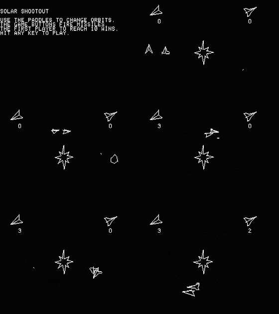
Finally, there's Solar Shootout, a 2-player game that I didn't bother my friends with.


This is a strange game, and if it's a remake of an older arcade game, then I didn't recognize its origins. You and your opponent orbit a pulsar, and are trying to shoot each other with your missiles. You adjust the radius of your orbit with the paddle, but can't affect your own speed or otherwise aim your missiles.

The other compilation disk, Trilogy of Games, also has a colorful, animated title.


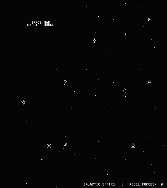
The first game, Space War, is a remake of, well Space War, and I assume specifically of Cinematronic's Space Wars. It's two-players only, and once again did not bother playing with my friends.

It's the original X-Wing vs. TIE Fighter! Sort of.


Paddles, with their limited range of motion, do not allow for 360 degree rotation as needed in this game, and needing to use the keyboard to fire torpedoes is a bit awkward, but at least the '1' and '0' keys are on opposite sides of it.

Next we have Night Driver, a remake of Atari's Night Driver.


The sense of speed is impressive, but I don't really understand how the game decides where you're steering or whether you've crashed or not.

Finally, there's Pinball.


It's pinball'ish. Nothing terribly exciting or sophisticated. The physics make no sense at all, and your longevity depends almost entirely on whether the flipper shields get turned on before the ball reaches them or not. The buttons on the paddle controllers hit the flippers, but you can't sustain an "up" position like can in most pinball sims, and an advertised "tilt" key doesn't seem to do anything.

Trilogy of Games is the better package of the two compilation disks, but it's still nothing I would spend much time on, and too unsubstantial for me to bother with a number or GAB rating.

Pinball, of course, is the perfect lead-in to Raster Blaster, his first self-published game, and an enormous hit in its day.


Just as the later David's Midnight Magic was directly based on the William's table Black Knight, Raster Blaster is based on Firepower, known for being the first pinball table to feature multiball and lane change.

Unusually for a pinball sim, Raster Blaster has a difficulty setting. The sole effect of it is that in easy mode, the side drain kickers are always on, while in hard they must be switched on first by hitting targets, and in the latter mode I last about as long as a snowball in the Sonoran.

Controls use the familiar two-paddle setup. The left dial controls the initial launch strength, but I can't see what difference it really makes. Tilt has a literal meaning here; in play, the left dial's position tilts the table's angle left or right. There is no gentle nudging here, but on the flipside the table will never lock out from a tilt either. That said, I hardly ever used this feature; it's not easy to turn the dial when you're gripping a paddle controller in each hand! I can't imagine having the dexterity to recognize when the ball is headed for a drain, adjust the dial to compensate, and return your hands to the paddles in time to save the ball.

Physics are pretty floaty, very bouncy, and not all that convincing, even to a non-fan of pinball like me. Notably, if you try to catch the ball between a flipper and ramp, a pretty common move in real pinball and most sims, the ball will bounce back and forth between the flipper and ramp without ever coming to rest. The highest achievement is to enable multi-ball mode by activating the robot arms and getting a ball into each one, but I couldn't consistently hit the arms, and have no idea how you'd even hit the top arm ever.

GAB rating: Average. Raster Blaster may have been a big deal at the time, but pinball sims don't do much for me, and I can't say I enjoyed this any more or any less than David's Midnight Magic.

Tuesday, April 7, 2020

Game 171: Penny Arcade

Our next whale is Pinball Construction Set, widely released by Electronic Arts in 1983, but originally self-published for the Apple II in 1982 by programmer Bill Budge.

Pinball Construction Set was based off the engine of Budge's 1981 best-seller Raster Blaster. The year before that, he released two compilation disks through California Pacific Computer Co; Space Album and Trilogy of Games.

His earliest credit, however, appears to have been a tech demo called Penny Arcade, which was distributed by Apple Computer themselves in a compilation package of AppleSoft BASIC tapes intended to show off the power and flexibility of this language which came standard on the new Apple ][+ line of computers, replacing the older and much more primitive Integer BASIC.


Penny Arcade is a Pong variant, and uses paddle controllers. The game even queries "MORE PONG?" at the end of a match, suggesting Penny Arcade was a last minute title change invoked to avoid Atari's wrath. The main feature distinguishing it from Pong is the selection of four different tables, each of which has a variety of obstacles for the ball to ricochet or rebound off of. In addition, a ten-setting difficulty option adjusts the game speed, and each table may be played with gravity on or off, which fundamentally changes the nature of the game.

"B" and I played a few rounds, sampling each table with gravity on or off, at a few different speeds. Mostly slower speeds, not just because we're both pretty bad at Pong, but also because at higher speeds, the paddle controls got laggy, as if that in order to drive the ball faster, the computer had to take some CPU cycles away from the paddle logic. By some calculations I did later, I estimate that, assuming a playfield 256 pixels long, the ball speed is 194px/s on the minimum difficulty, 295px/s on the highest, and the difficulty curve is logarithmic.

The first table on the list is called "Bumper Pool."


Two things characterize this board. The first is the set of bumpers in the middle row of the board, which adds some chaos to the play, especially as the ball passes through the cluster in the middle. It's difficult to predict whether the ball will ricochet from a horizontal edge, vertical edge, or just pass through them entirely, and therefore difficult to predict which direction the ball will be going. The second is the narrow field goals. In stark contrast to Pong where you must hit the ball every time it reaches your side of the screen, here you can keep your paddle restricted to the relatively small opening, though you may still want to chase the ball wherever it goes in order to better control its bounce angle.

Gravity on generally makes things more difficult.


Right off the bat, the serving shot arcs right for the goal zone, and the receiving player must be ready to catch it immediately. The ball's parabolic arc also makes predicting which bumpers it will hit more difficult.

The next table is "Tennis."


An appropriate enough theme for a Pong game, and with some parallel to 1958's Tennis for Two, but this doesn't feel much like tennis. It's just Pong with a rebounding barrier in the middle of the screen - unlike tennis, you can bounce the ball off the net as much as you want.

You might think gravity would improve the tennis simulation, but it doesn't help that much, and mainly makes it difficult to consistently arc the ball high enough to clear the net.


Notably, this was the only board to feature open screen edges like Pong. But this was the least interesting board, and I was happy to move on from it.

Next up, "Hockey," featuring a layout that makes things kind of wacky and also kind of fun.


The layout and small goals do mean a lot of downtime where the ball is doing its own thing, away from the goals and paddles, much like playing hockey as a goalie must be. It's quite possible to score an own goal, given the distance that the paddles are placed in front.


Gravity does mean more time spent on the lower part of the board.


And lastly, there's "Scramble," which seems like it's trying to be chaotic and wacky, but isn't as successful as hockey.


The tunnels here mean lots of rebounding, but doesn't change the ball's direction in a way that makes it challenging to catch them. The cages are the most interesting feature, as they are positioned exactly in a way to knock the ball right back at your goal.

Gravity, as with other boards, makes things less interesting overall.


GAB rating: Average. Way back when I introduced ratings, I retroactively rated Pong Below Average, but noted that it might rank average if it controlled better. Penny Arcade still feels a bit jittery, and it's possible to turn the dial faster than the paddle can follow in realtime, but definitely controls better overall, and the various layouts make things interesting more than they corrupt Pong's purity. A vanilla table might have been nice too.

That said, I can't say this would have held either of our interests for much longer than the 20 minutes that it took to sample everything.

One thing I wanted to mention here was that I found the code to be tantalizing. The BASIC code isn't obfuscated in any way and is plainly readable with the LIST command. There are only 119 lines, none of them are particularly nasty looking, and more than half of them concern the menus rather than gameplay. And yet, I have no idea how the gameplay code works. I can't even figure out which lines are responsible for setting up the playfield or handling the ball gravity, let alone understand what they do. There's a lot of poking, peeking, and calling going on, and it makes me wonder if the tape has some hidden assembly on it, if that's even possible - you play by booting into AppleSoft BASIC, typing LOAD, playing the tape, and then typing RUN when it's loaded.